The quintessential purpose of A-frame safety signs is threefold: to facilitate the identification of potential hazards, to explicitly proscribe or mandate specific behaviors, and to provide direction for emergency response. To achieve these objectives, it is imperative to make a clear distinction among the fundamental functions, categorical classifications, installation contexts and critical points of A-frame safety signs. Such a methodical approach is instrumental in augmenting the safety standards of public domains and safeguarding the sanctity of private spaces.
1. Classification of A-frame Signs
A-frame signs are conventionally categorized into five principal types:
1.1 Prohibition A-frame Signs
Emblazoned with universally recognized symbols such as red circles or diagonal slashes, these signs serve to intuitively communicate the interdiction of certain actions or entry into restricted zones. Prevalent applications include the prohibition of smoking, unauthorized parking, and climbing over guardrails.
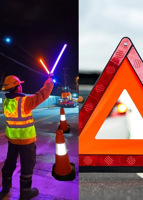
1.2 Warning A-frame Signs
Utilizing yellow or orange color with a triangular configuration, these signs are designed to alert individuals to potential perils. Common ones include warnings for slippery surfaces, falling debris, and live electrical components.
1.3 Mandatory Action A-frame Signs
Characterized by blue circular backgrounds, these signs stipulate compulsory actions deemed necessary for reducing risk. Instances include wearing safety helmets, goggles, or protective gloves.
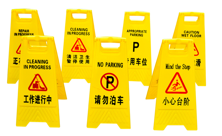
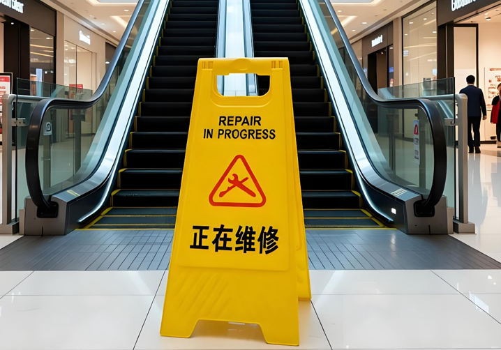
1.4 Instruction / Direction A-frame Signs
Typically rendered on blue or green rectangular bases, these signs give vital information about action directions, evacuation exits, and emergency assembly points, thereby expediting correct behavior choices.
1.5 Information / Emergency A-frame Signs
This category encompasses indicators for fire facilities, emergency telephones, first aid points, and evacuation routes. They are intrinsically linked to life-preserving escape and rescue operations.
2. Installation Points for A-frame Signs
2.1 General Installation Key Points
2.1.1 Prohibition Signs
Install them at entrances and corners of passages to ensure visibility before entry. Avoid overlapping with information signs to prevent misunderstanding.
2.1.2 Warning Signs
Place them 15–30 cm in front of the risk point. The visual distance and viewing angle should align with the natural line of sight.
2.1.3 Mandatory Signs
Permanently locate them at operation area entrances, production lines, and places requiring immediate compliance.
2.1.4 Instruction Signs
Set along evacuation channels to ensure visibility within the shortest viewing distance. Illumination or self-luminous materials are recommended for night use.
2.1.5 Information / Emergency Signs
Install them close to equipment or emergency points to ensure rapid positioning during emergencies.
2.2 Scenario-Specific Installation Nuances
2.2.1 Commercial Complexes and Shopping Centers
Focus on clarity of instructions. Mark entrances, parking areas, and emergency exits clearly. Increase symbol usage in multilingual environments.
2.2.2 Transportation Hubs
Warning signs should offer high recognition and rapid response, installed permanently at entrances, transfer passages, and exits with night visibility.
2.2.3 Schools and Educational Institutions
Balance comprehension levels using intuitive symbols and concise language. Multilingual versions may be required.
2.2.4 Medical Institutions
Prioritize emergency evacuation routes, ambulance points, and accessible pathways to ensure rapid response.
2.2.5 Office and Residential Areas
Clearly mark safety exits, firefighting facilities, and construction areas. Access-controlled zones should be prominently identified.
2.2.6 Construction Sites and Temporary Sites
Due to complex risks, warning signs should be forward-positioned. Temporary and construction boundaries must be clearly marked and updated.
2.2.7 Personal Spaces
Ensure protection of private property by preventing unauthorized access. Prohibition and mandatory signs are commonly applied.
3. How to Choose the Appropriate A-frame Signs
3.1 Graphic Design Considerations
Ensure sufficient contrast between text and background to meet readability standards. Use simplified, internationally recognized symbols and avoid word-only warnings. Multilingual scenarios may require supplementary translations or generic symbols.
3.2 Material Selection
For low-light environments, reflective coatings, auxiliary lighting, or self-luminous materials are crucial. Signs should be waterproof, wear-resistant, moisture-resistant, and impact-resistant, with materials selected based on indoor or outdoor use.
3.3 Accessibility and Inclusivity
Consider users with visual, hearing, or speech impairments. Tactile signage, braille versions, secondary markers, or QR codes can be provided to enhance accessibility.
4. Bestway Solution
The institution of systematic and classified management, combined with a judicious investment strategy for A-frame safety signs, can significantly elevate site safety standards and reduce adverse events. These signs are not merely indicators but essential tools for behavioral governance and risk communication.
Bestway provides one-stop customization services for A-frame signs with high visibility and reliable performance. Professional staff are available to customize details and offer practical recommendations. Whether you are a driver, business professional, or safety manager, Bestway is your ideal safety tool supplier to help maximize the return on safety investments.